With the muted neutral tones being rocked down the runways for the few past few days, there is finally light at the end of the color spectrum tunnel with hues so colorful it makes the rainbow look dull. A few of the designers that have being dabbling in colors and prints includes Marc Jacobs, Rachel Roy, Ports 1961, and a few other talents.
Might I say in the words of Rachel Zoe, Marc Jacobs is "Literally, SHUTTING IT DOOOWNNN!!!" From his original line Marc Jacobs to Marc by Marc Jacobs. Mr. Jacobs has deviated from his 1950's silhouette of Louis Vuitton for one of my favorite fashion decades, the 1970's as a reference point for his Spring 2011 collections. The collections is reminiscent of the movie "Mahogany" a la Ms. Diana Ross to the Glamourous days of Studio 54 a la Bianca Jagger and the Disco Crew. IMO (In my opinion) Marc's S/S 2011 collections is probably if not the best, one of the best collections for this coming spring season.
For the Color spectrum on the colorful side of things, I'm seeing alot of ceruleans, blueberries, fuschias, cranberries, cerises, oranges and anything in between. At the same time they hold this muted quality in their shades. I love it!!!!
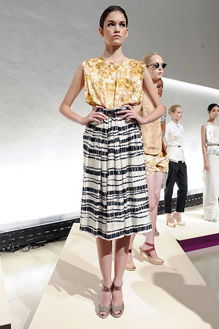
If you want to know what the print is of the season, its all about STRIPES. Whether it is on pants, skirts, dresses, etc.
Below is Photos from the collections that are rocking away from the neutral tone bandwagon (Side-note: But I still love the neutrals) Photos from Elle.com:
MARC JACOBS:
 |
 |
 |
 |
 |
 |
 |
 |
 |
 |

MARC BY MARC JACOBS:
 |
 |
 |
 |
 |
 |
 |
 |
 |
 |
 |
 |
 |
 |
 |
 |
 |
 |

RACHEL ROY:
 |
 |
 |
 |
 |
 |
 |
 |
 |
 |
 |
 |
 |
 |
PORTS 1961:
 |
 |
 |
 |
No comments:
Post a Comment